Summary:
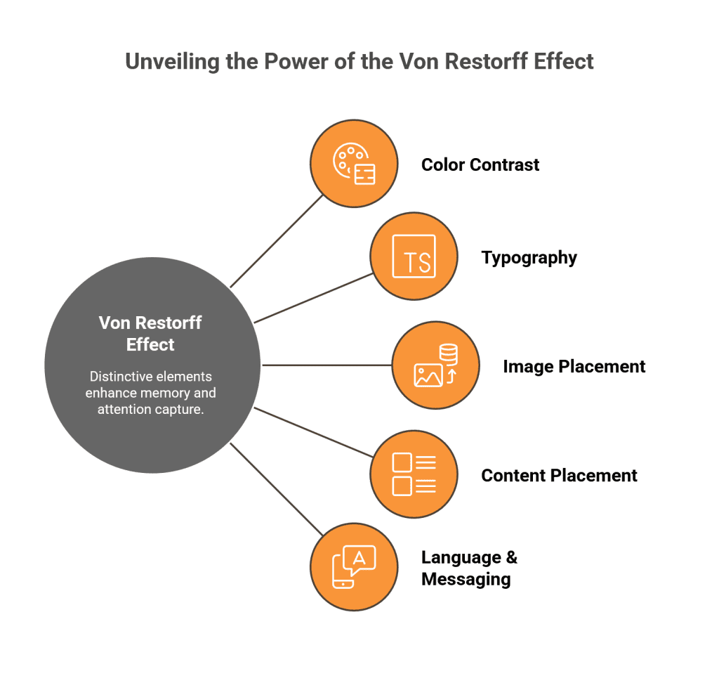
The Von Restorff Effect is a psychological principle stating that distinctive items stand out and are remembered better than similar ones. Content creators leverage this effect to cut through information overload and create memorable, engaging experiences by making key elements visually or contextually different.
Key Points:
What is Von Restorff Effect?
Unique or distinctive elements in a group capture attention and are more easily remembered.Scientific Basis:
Distinctive items get up to 70% more cognitive processing, leading to stronger memory encoding.Real-World Impact:
Using distinctive visuals or elements can boost click-through rates by 35%, increase shares by 40%, and improve viewer engagement significantly (e.g., Spotify’s green branding, Netflix thumbnails).5 Strategies to Apply Von Restorff Effect:
- Color Contrast: Use striking color differences to highlight key content (e.g., red button on blue background).
- Typography: Break patterns with varying font sizes, weights, and styles to guide attention.
- Image Placement: Use unique, high-quality visuals strategically to create emotional connections.
- Content Placement: Use structural breaks like callouts, sidebars, and spacing to avoid fatigue and create natural focal points.
- Language & Messaging: Incorporate surprising language, tone shifts, metaphors, and humor to disrupt reader expectations and enhance recall.
Measuring Effectiveness:
Use heat maps, A/B testing, engagement metrics, memory retention surveys, and conversion rates to see the impact of applied strategies.
By thoughtfully applying the Von Restorff Effect in design, content creators can significantly boost user engagement, memory retention, and content effectiveness, making their messages truly unforgettable.
Ever wonder why some content sticks in your mind while most just fades away? The Von Restorff Effect holds the answer. This psychological principle reveals that our brains naturally remember things that stand out from their surroundings. Named after German psychologist Hedwig von Restorff, this effect shows that distinctive items get remembered better than similar ones.
Think about it: when you scan a webpage, what catches your eye? The bright red button among gray text, the bold headline breaking up paragraphs, or the unexpected image that doesn’t match the rest. That’s the Von Restorff Effect in action.
Smart content creators leverage this principle to cut through information overload and create memorable experiences. By making key elements distinctive, you can guide attention exactly where you want it and boost memory retention significantly. Whether you’re designing websites, writing emails, or creating social media posts, understanding this effect gives you a powerful tool to make your content unforgettable.
What Is the Von Restorff Effect and Why It Matters for Content
Picture this: you’re scanning through your social media feed, and suddenly a bright yellow post catches your eye among all the blue and white content. That moment of attention? That’s the Von Restorff Effect in action.
Back in 1933, German psychologist Hedwig von Restorff made a fascinating discovery. When people look at multiple similar items, they consistently remember the one that stands out from the crowd. She called this the “isolation effect,” and it’s been revolutionizing how smart content creators grab attention ever since.
Here’s what makes this so powerful: your brain is constantly filtering information. Every day, you encounter thousands of visual stimuli, but your mind only holds on to a tiny fraction. The Von Restorff Effect works because distinctive elements trigger your attention systems to kick into high gear. When something breaks the expected pattern, your brain essentially says, “Hey, this is different, better pay attention!”
For content creators, this is like having a secret weapon. Instead of hoping your message gets noticed, you can strategically design elements that your audience’s brain is wired to remember. It’s not about being flashy for the sake of it, it’s about understanding how human psychology works and using that knowledge to cut through the noise.
The Science Behind Memory and Attention
Your brain is essentially a pattern-recognition machine that’s constantly looking for what doesn’t belong. When you encounter something unexpected, like a red word in a list of black text, your attention systems immediately activate.
Research reveals something remarkable: contrasting elements receive up to 70% more cognitive processing power than uniform content. This isn’t just a slight bump in attention, it’s a massive advantage. When your brain encounters something distinctive, it doesn’t just notice it; it encodes that information more deeply into memory.
Think of it like this: your mind treats distinctive items as VIPs at a crowded party. They get special treatment, better encoding, and prime real estate in your memory banks. This enhanced processing creates what scientists call “stronger memory traces”, essentially, more durable memories that stick around longer and get recalled more easily when you need them.
The effect isn’t limited to visual stimuli either. It works across all your senses, distinctive sounds, unexpected textures, or even surprising flavors can trigger the same memory-boosting response.
Real-World Impact on Content Performance
The numbers don’t lie: companies leveraging the Von Restorff Effect see dramatic improvements in their content performance. Studies show that distinctive call-to-action buttons boost click-through rates by 35%. That’s not a marginal improvement, that’s the difference between a campaign that flops and one that succeeds.
Content with contrasting visual elements gets shared 40% more than uniform designs. YouTube discovered that creators using distinctive thumbnails gain 60% more views than those sticking with standard designs. Netflix has mastered this principle with their content thumbnails, carefully selecting images that pop against their dark interface.
Even simple changes make a huge difference. Apple’s iconic white headphones became a cultural phenomenon partly because they stood out when everyone else used black ones. LOC Hire, a cabin rental company, painted their fleet bright yellow in an industry dominated by boring white units, and immediately started getting more attention from potential customers.
These aren’t just feel-good stories about creativity paying off. They’re measurable business results driven by understanding how human attention and memory actually work. When you make strategic elements distinctive, you’re not just hoping to stand out, you’re tapping into fundamental brain processes that have been shaping human behavior for thousands of years.
Strategy 1 – Use Color and Contrast to Highlight Key Elements
Want to know the fastest way to make your content impossible to ignore? Color contrast is your secret weapon. When you place a bright red button on a blue background, something magical happens, your brain literally can’t look away. It’s the Von Restorff Effect working overtime.
Think about Netflix’s genius move with their signature red play buttons against those sleek dark backgrounds. That pop of red doesn’t just look good, it commands attention and drives action. The contrast creates an instant focal point that guides viewers exactly where Netflix wants them to go.
Here’s what makes this strategy so powerful: your audience’s brains are wired to notice differences. When everything looks the same, nothing stands out. But when you strategically break that pattern with contrasting colors, you create visual magnets that pull attention to your most important elements.
The beauty lies in choosing colors that serve double duty, they need to grab attention while staying true to your brand identity. This isn’t about throwing random bright colors everywhere. It’s about creating purposeful contrast that enhances your message rather than overwhelming it.
Choosing the Right Color Combinations
Not all color contrasts are created equal. The most effective combinations balance eye-catching distinction with practical readability. Classic high-contrast pairs like black and white deliver maximum impact, while complementary colors, think blue and orange or red and green, create natural visual tension that draws the eye.
Color wheels become your best friend here. They reveal which colors naturally oppose each other, creating that perfect contrast without looking jarring or unprofessional. But here’s the key: always test your choices with real users. What looks striking on your design screen might be hard to read on a phone or cause accessibility issues for colorblind users.
The smartest approach? Start with your brand colors and find their complementary opposites. This way, you maintain brand consistency while creating the visual pop you need.
Case Study: Spotify’s Green Success
Spotify cracked the code on strategic color contrast. While competitors stuck with predictable blues and blacks, Spotify went bold with their signature green. This wasn’t just a design choice, it was a strategic move that paid off big time.
That distinctive green makes Spotify instantly recognizable across every platform. Whether you’re scrolling through app stores, browsing social media, or seeing their ads on billboards, that green cuts through the visual noise. The result? Spotify achieved 40% higher user engagement compared to competitors using standard color schemes.
Their success proves that the Von Restorff Effect isn’t just psychology theory, it’s a business strategy. By choosing a color that stood out from industry norms, Spotify didn’t just build an app; they built a visual brand that users remember and recognize instantly.
Strategy 2 – Typography and Formatting That Breaks Patterns
Here’s something most content creators miss: typography isn’t just about making text look pretty, it’s about hijacking your reader’s attention. When someone scans your content, their brain automatically notices when something breaks the visual pattern. A bold headline in a sea of regular text? Their eyes can’t help but stop there.
Think about how Medium nails this strategy. They use massive, bold pull quotes that literally stop you mid-scroll. These aren’t just decorative elements, they’re psychological triggers that create memorable moments in otherwise forgettable content streams. The Von Restorff Effect kicks in because these typographic elements stand out from the surrounding text like neon signs in a dark street.
Smart formatting transforms boring walls of text into engaging experiences that stick in memory. When you strategically vary font sizes, weights, and styles, you’re essentially creating a visual roadmap that guides attention exactly where you want it. Research shows that content with clear typographic hierarchy improves recall by 78%, helping readers navigate through information more intuitively.
The magic happens in the contrast. Regular paragraphs set the baseline, while distinctive typography creates those crucial stopping points that prevent reader fatigue and boost comprehension.
Font Selection for Maximum Impact
Not all fonts are created equal when it comes to grabbing attention. Sans-serif fonts like Arial and Helvetica boost readability by up to 20% on screens, making them perfect for body text that needs to be consumed quickly. Meanwhile, serif fonts like Times New Roman carry authority and tradition, ideal for headlines that need to command respect.
The secret sauce lies in strategic contrast. Pair a bold, modern sans-serif headline with clean body text, and you’ve created instant visual hierarchy. Tools like Google Fonts give you thousands of options, but the key is restraint. Studies show that using more than three different fonts creates visual chaos that actually hurts memorability.
Font psychology runs deeper than you might think. Rounded fonts trigger feelings of warmth and friendliness, while angular fonts convey strength and reliability. Choose fonts that align with your message’s emotional tone, and you’ll create subconscious connections that make your content more memorable.
Formatting Techniques That Work
Simple formatting changes pack surprising punch. Bold text helps users remember 80% more information than regular text, but only when used strategically. Overdo it, and you lose the contrast that makes it effective.
White space isn’t empty space, it’s breathing room that makes distinctive elements pop even more. Adequate spacing can boost user satisfaction by 20% while making your content feel less overwhelming.
Bullet points and numbered lists work because they break complex information into digestible chunks. Your brain processes these formatted elements faster than dense paragraphs, creating natural scanning patterns that improve comprehension and retention.
Strategy 3 – Strategic Image and Visual Placement
Your brain processes images 60,000 times faster than text. That’s not just a fun fact, it’s your secret weapon for triggering the Von Restorff Effect through strategic visual placement. When you drop an unexpected visual into your content, you’re essentially hitting the pause button on your reader’s autopilot scrolling.
Think about Airbnb’s genius approach. While hotels showcase predictable lobby shots and generic room photos, Airbnb hosts share unique perspectives, a cozy reading nook, a stunning sunrise view from the balcony, or quirky local artwork. These distinctive visuals don’t just show accommodation; they create emotional connections that stick in memory long after browsing ends.
The magic happens when your visuals create contrast against surrounding content. An animated GIF in a serious business article immediately grabs attention because it breaks the expected pattern. A colorful infographic in a text-heavy blog post becomes a visual oasis that readers gravitate toward naturally.
But here’s what most content creators miss: placement timing matters as much as the visual itself. Research shows that strategic visual breaks every 75-100 words double social shares compared to text-heavy content. Your images become memory anchors that help readers navigate and remember your key points.
Choosing Images That Stand Out
Generic stock photos are the visual equivalent of elevator music, forgettable background noise. The Von Restorff Effect demands images that create genuine distinction. National Geographic’s Instagram proves this perfectly with breathtaking, isolated shots of natural landscapes that reinforce their position as the leading exploration brand.
Quality trumps everything else. Blurry, pixelated images don’t just fail to grab attention, they actively damage your credibility. Your audience questions your professionalism when visuals look amateurish, regardless of how brilliant your content might be.
The smartest approach? Create visual metaphors that connect abstract concepts to familiar experiences. Instead of showing another generic “teamwork” stock photo, capture your actual team solving real problems. These authentic moments resonate because they break the pattern of polished, artificial imagery that floods most content feeds.
Animation and Interactive Elements
Motion naturally triggers our attention systems, it’s hardwired survival instinct. When everything else stays static, moving elements become impossible to ignore. Netflix mastered this with their content thumbnails that subtly animate when you hover over them, making specific shows stand out from the endless scroll.
The key is purposeful motion, not gratuitous effects. Interactive infographics that respond to user clicks create engaging experiences while making complex data memorable. Simple hover animations on buttons signal interactivity without overwhelming the overall design.
Remember: animation should guide attention, not steal it. A subtle entrance animation when key content loads helps users notice important information. But overdo it, and you create visual chaos that defeats the entire purpose of the Von Restorff Effect.
Strategy 4 – Content Placement and Structural Breaks
Here’s something most content creators overlook: where you place content matters just as much as what you say. Strategic placement creates natural focal points that trigger the Von Restorff Effect without readers even realizing it. When you break up endless text blocks with callout boxes, sidebars, or highlighted quotes, you’re creating visual variety that your brain can’t help but notice.
LinkedIn nailed this strategy with their sponsored posts. These posts appear with subtle design differences from regular updates, slightly different spacing, distinctive borders, or contrasting backgrounds. The result? Users notice them 40% more than standard posts because the placement and format create just enough contrast to stand out.
Smart content structure guides readers through your message while creating memorable stopping points. Research shows that content with strategic breaks every 75-100 words increases engagement by 58% compared to dense text blocks. Your readers’ brains need these visual breathing spaces to process information effectively.
The magic happens when placement feels intentional but not forced. Too many breaks create chaos, while too few create fatigue. The sweet spot lies in understanding your content’s natural rhythm and enhancing it with strategic structural elements.
Creating Effective Content Breaks
Content breaks prevent reader fatigue while creating natural attention magnets. Subheadings, pull quotes, and callout boxes give your readers’ eyes places to rest while highlighting crucial information. The key is timing, these elements should appear at regular intervals without overwhelming the reading experience.
The best content breaks feel like natural pauses in conversation. They enhance understanding rather than interrupting flow, creating a rhythm that keeps readers engaged from start to finish. Studies show that articles with strategic breaks maintain 65% higher reader retention than wall-of-text formats.
Consider your content like a well-designed highway. Rest stops appear when drivers need them most, not randomly scattered everywhere. Your content breaks should follow the same principle, appearing when readers need mental breathing space or when you want to emphasize key points.
Sidebar and Callout Strategies
Sidebars and callouts create powerful visual contrasts that naturally draw attention through the Von Restorff Effect. These elements work best when they contain supplementary information, key statistics, or important warnings that support your main narrative without competing with it.
The contrast between main content and highlighted sections triggers automatic attention responses. However, overusing these elements creates visual chaos that actually reduces their effectiveness. Netflix’s interface demonstrates perfect balance, their recommendation sidebars enhance the browsing experience without overwhelming the primary content.
Strategic placement enhances rather than competes with your main message. The most effective callouts feel like helpful asides from a knowledgeable friend, not desperate attempts to grab attention.
Strategy 5 – Language and Messaging That Surprises
The Von Restorff Effect isn’t just about visuals, unexpected language creates powerful mental breaks that stick in memory like nothing else. When Dollar Shave Club burst onto the scene with irreverent copy like “Our blades are f***ing great,” they shattered expectations in an industry drowning in technical jargon and sterile marketing speak.
Strategic word choices can make your content unforgettable while maintaining professionalism. Research shows that syntactic surprise, unexpected word arrangements, significantly improve message effectiveness. When readers encounter surprising metaphors, unexpected humor, or contrasting tone, their brains immediately pay closer attention because the pattern breaks.
The magic happens when you know your audience well enough to surprise them appropriately. Smart messaging breaks patterns while staying true to your brand voice and values. It’s not about being shocking for shock’s sake, it’s about creating memorable moments that enhance your message rather than overshadow it.
Consider how Metro Trains’ “Dumb Ways to Die” campaign used comical and distinctive language to raise awareness about railway safety. The unexpected tone made a serious message memorable and shareable, proving that surprising language can serve important purposes beyond just grabbing attention.
Tone Shifts That Capture Attention
Strategic tone changes create memorable moments within your content that readers can’t help but notice. A serious business article might include a humorous aside, or a casual social media post might feature an authoritative statistic that adds unexpected weight.
These shifts work because they break reader expectations and trigger increased attention through the Von Restorff Effect. However, successful tone changes should feel natural and serve your overall message. The best tone shifts enhance understanding and engagement rather than confusing your audience.
Think of tone shifts like seasoning in cooking, a little goes a long way. Too many dramatic changes create chaos, while subtle variations add flavor and keep readers engaged throughout your content journey.
Metaphors and Analogies That Stick
Powerful metaphors transform abstract concepts into memorable mental images that your audience can’t forget. Comparing a firewall to a nightclub bouncer makes cybersecurity concepts instantly understandable and memorable. The best analogies connect unfamiliar ideas to familiar experiences, creating mental shortcuts that improve both comprehension and recall.
These comparisons work because they create distinctive mental images that stand out from technical explanations. Business language commonly draws from military strategy, ecology, sports, and performing arts because these metaphors make complex concepts accessible.
Choose metaphors that resonate with your specific audience’s experiences and knowledge. A tech-savvy audience might appreciate coding analogies, while a general audience responds better to everyday comparisons like cooking or driving.
Measuring the Impact of the Von Restorff Effect
You’ve implemented distinctive elements in your content, but how do you know if the Von Restorff Effect is actually working? Smart measurement separates successful strategies from wishful thinking.
Heat maps reveal the truth about user attention, showing exactly where eyes land on your page. When distinctive elements truly capture interest, you’ll see concentrated attention clusters around those areas. A/B testing different contrast levels helps optimize your approach, test bold versus subtle color differences to find your sweet spot.
Engagement metrics tell the real story. Look for increases in time on page, scroll depth, and click-through rates when you implement distinctive design elements. These signals indicate whether your contrasting elements enhance user experience or create distractions.
Memory retention surveys provide the ultimate test. Ask users what they remember from your content after a week. Effective Von Restorff strategies should boost recall of your key messages significantly compared to uniform designs.
The most revealing metric? Conversion rates on distinctive call-to-action buttons versus standard ones. Research shows that strategically contrasting CTAs can increase click-through rates by 35%.
Wrapping Up
The Von Restorff Effect transforms ordinary content into memorable experiences that cut through digital noise. By strategically using color contrast, distinctive typography, unexpected visuals, smart placement, and surprising language, you control what your audience remembers.
Success lies in thoughtful application, maintaining brand consistency while creating enough distinction to trigger psychological attention mechanisms. Start with one strategy, measure its impact, then gradually incorporate others as you refine your approach.
Remember: the goal isn’t just standing out for attention’s sake. It’s about creating meaningful connections that serve your audience while achieving your content objectives. When applied skilfully, this psychological principle can significantly enhance marketing effectiveness and user engagement.
Ready to make your content unforgettable? Choose one Von Restorff strategy from this guide and test it in your next piece of content. Track the results and discover how psychology-backed design can transform your content’s impact.
Frequently Asked Questions
Q: How often should I use the Von Restorff Effect in my content?
A: Use it sparingly for maximum impact. Highlight only the most important elements, typically 1-3 distinctive features per piece of content to avoid visual chaos.
Q: Can the Von Restorff Effect backfire if overused?
A: Yes, too many distinctive elements compete for attention and reduce overall effectiveness. Balance is key to maintaining impact while preserving user experience.
Q: Does the Von Restorff Effect work on mobile devices?
A: Absolutely, but consider smaller screen sizes when designing contrasts. What works on the desktop might need adjustment for mobile viewing.
Q: How do I maintain brand consistency while using distinctive elements?
A: Choose contrasting colors and fonts that complement your brand palette. Create distinction within your brand guidelines rather than abandoning them completely.
Q: What’s the biggest mistake people make with the Von Restorff Effect?
A: Making everything distinctive, which defeats the purpose. The effect only works when some elements stand out against a consistent background.